It's often said there's a lot of warming in the North Atlantic & surrounding land stations so let us check there first with the RSS TLT temps in a square as depicted in the following map:

There is some warming in excess of the global average. It looks similar to the temps for North latitudes 21.25 N to 36.25 N (see graphs further down). In red is the code for Matlab R2016a.
To create data for all area outside the rectangle (Everywhere but North Atlantic):
a1 = ncread('uat4_tb_v03r03_anom_chtlt_197812_201602.nc3.nc','brightness_temperature_anomaly') %the main variable%
a7 = a1
a7(36:80,44:63,:) = 0
a8 = a1-a7 %for later%
nonNor = (squeeze(tsnansum(a7(:,:,:))))
nonNor2 = squeeze(tsnansum(nonNor(:,:)))'
nonNor3 = nonNor2/((72*144)-(45*20))
nonNor2 = squeeze(tsnansum(nonNor(:,:)))'
nonNor3 = nonNor2/((72*144)-(45*20))
To create data inside the above rectangle (North Atlantic):
Nor = (squeeze(tsnansum(a8(:,:,:))))
Nor2 = squeeze(tsnansum(Nor(:,:)))'
Nor3 = Nor2/(45*20)
The result:

The non-north Atlantic graph is similar to the global graph. There's a lot of warming in the tropics, especially to their north. And also a bit in North Atlantic and North Pole (more graphs below).
Let us try northern hemisphere & southern hemisphere divide.
My NH:
w5 = squeeze(tsnansum(a1,1))
nH = squeeze(tsnansum(w5(37:72,:)))'
nH3 = nH/(144*36)

RSS version (from here --> here).

My SH:
sH = squeeze(tsnansum(w5(1:36,:)))'
sH3 = sH/(144*36)

RSS SH (data):

My North and South Hemisphere together:

The above graph ends in Feb 2016 around the peak of the El Nino. Notice how much bigger it is in the northern hemisphere. Could this lopsided warming possibly be global warming?? Of course not!
Add them together for global. My graph:

RSS graph (data):

My graph is slightly different I'm guessing because I'm weighting the poles too much. Because of the type of projection, the grid points bunch up toward the poles and thereby provide a disproportionate influence on the global average. A cosine function is a likely remedy to counteract it.
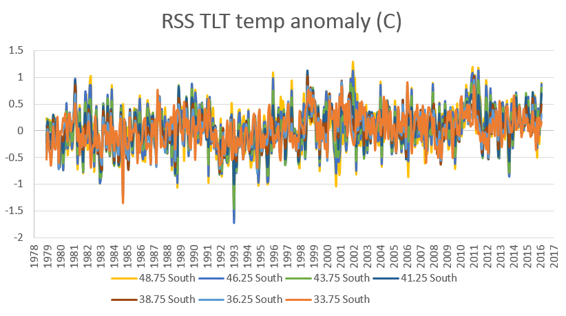
But the foregoing issue shouldn't impact these following graphs which have a narrower range of about 7 grid points which corresponds to about 17.5 degrees of latitude.
My graphs for various latitude bands. For these I eliminated the longitude dimension with:
w5 = squeeze(tsnansum(a1,1))'
AllLat = w5/144
Then I copied the data into Excel with:
mat2clip(AllLat)
...and manually made some graphs.
X-axis label is Years (Dec 1978 to Feb 2016):


Some Excel files I used:
https://drive.google.com/open?id=0B-wD9lfH3doOdW5UcEZpLVJLa1k
https://drive.google.com/open?id=0B-wD9lfH3doOUWY1b2JsdFY3Q00
https://drive.google.com/open?id=0B-wD9lfH3doOUHNkQ0JUNDhKWGc
No comments:
Post a Comment