=========================
UPDATE 10 March 2017: I got the longitude wrong by 180 degrees. Explanation here:
http://planetaryvision.blogspot.com.au/2017/03/rss-temp-anomaly-for-australia.html
Graph should look like this:

It was still close enough though. There is no warming in Australia during satellite period.
END UPDATE.
=========================
Now that I can open NetCDF files in Matlab I can look at various climate-related data files and reveal data by longitude and latitude, kind of like Steven Goddard does only not as good.
You can get the data for RSS TLT here:
http://www.remss.com/measurements/upper-air-temperature
↳
ftp://ftp.remss.com/msu/data/netcdf
Using the file:
"uat4_tb_v03r03_anom_chtlt_197812_201509.nc3.nc" I can dial in any latitude and longitude or area.
First, for comparison sake here's what I get averaging the whole earth:
 |
| Temp Anomaly (C). X-axis: months since 1 Jan 1978. Last month is Sep 2015 |
If you compare it to the WoodForTrees RSS graph they're slightly different:

Perhaps adjustments should be made to make my data look more like theirs, e.g. for the distorting effect of the Gaussian projection -- the data points bunch up at the poles. But my graph looks close enough that I'm happy to proceed.
If I average all data in the coordinates roughly corresponding to the following area in the orange rectangle (113 to 147 East, 17 to 34 South)....

...I get the following graph:

Australia's warmed a bit but not much, especially since 1997.
Compare that graph to the CSIRO "homogenised" graph and you can see the difference. Keep in mind in the CSIRO graph anomalies are with respect to a different (lower) baseline:
 |
| Annual mean temperature anomalies for Australia (compared with 1961–1990 average). The black line shows the 10-year moving average. |

It appears the CSIRO graph is up-tweaked compared to RSS satellite.
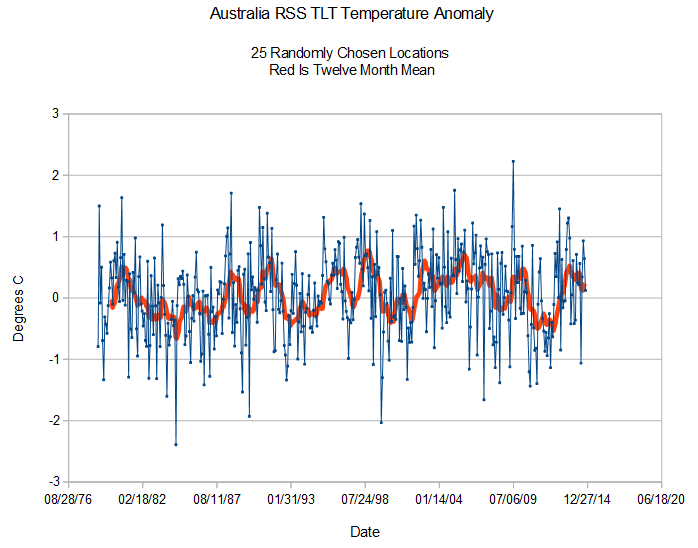
Now let's compare a Steve Goddard graph for 25 random points in Australia. My graph looks more like Steven's than the CSIRO's but still a bit different:

No comments:
Post a Comment