Carl Mears of remote sensing systems is a staunch warmist and has recently produced a new version of TLT that just so happens to comply with the global warming theory. Below shows the strange difference between northern and southern hemisphere uptweaking.
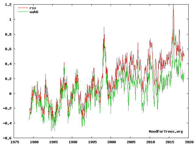
Using the WoodForTrees website we can compare RSS v4.0 to UAH v6.0 to get an idea of the uptweaking. This divergence didn't exist before between the two data sets.

I got the v3.3 data from here but it requires registration. I've mirrored the files if you don't want to register:
ftp://ftp.remss.com/msu/data/netcdf_cdr/
Version 3.3 TLT
ftp://ftp.remss.com/msu/data/netcdf_cdr/uat4_tb_v03r03_anom_chtlt_197812_201705.nc (mirror)
The v4 data I got from a different site because I couldn't find an equivalent format on the REMSS site.
Version 4.0 TLT
https://www.ncei.noaa.gov/data/mean-layer-temperature-rss/access/uat4_tb_v04r00_anom_chtlt_s197812_e201811_c20181204.nc (mirror)
The rationale for the uptweaked version is here http://www.remss.com/blog/faq-about-v40-tlt-update/ which gives a link to the paper here:
http://journals.ametsoc.org/doi/pdf/10.1175/JCLI-D-16-0768.1
Roy Spencer article here:
http://www.drroyspencer.com/2016/03/comments-on-new-rss-v4-pause-busting-global-temperature-dataset/
Bob Tisdale article here:
https://wattsupwiththat.com/2018/10/16/the-new-rss-tlt-data-is-unbelievable-or-would-that-be-better-said-not-believable-a-quick-introduction/
The rationale given for the changes given from version 3.3 to 4 are to do with slight changes in the satellite's time to actual surface local time. It sounds like a minor effect. I don't have time to go through it to see if the theory is legit but I can look at the uptweaks by region to see if it looks suspicious.
This is the code to unlock the nc files in Matlab and the resulting graphs. Let matrix g1 represent version 3.3 and d1 version 4.0:
g1 = ncread('uat4_tb_v03r03_anom_chtlt_197812_201705(1).nc','brightness_temperature_anomaly')
d1 = ncread('uat4_tb_v04r00_anom_chtlt_s197812_e201811_c20181204.nc','brightness_temperature_anomaly')
To get the southern hemisphere for v3.3 we use latitudes 1 through 36 and compress to a single series of numbers so we can graph it:
sh3 = squeeze(tsnansum(g1(:,1:36,:)))
sh3b = squeeze(tsnansum(sh3(:,:)))'
sh3c = sh3b/(144*36)
plot(sh3c)
I do the same for matrix d1 to get version 4, which yields these two graphs (I actually plotted it in Excel using the mat2clip function):
Now if you subtract one from the other you can see the uptweaking:
Notice how there's very little uptweaking until about the year 2002 which coincidentally is when James Hansen started uptweaking the GISS surface record.
Now I do the same as above for the northern hemisphere:
nh3 = squeeze(tsnansum(g1(:,37:72,:)))
nh3b = squeeze(tsnansum(nh3(:,:)))'
nh3c = nh3b/(144*36)
plot(nh3c)
mat2clip(nh3c)
nh4 = squeeze(tsnansum(d1(:,37:72,:)))
nh4b = squeeze(tsnansum(nh4(:,:)))'
nh4c = nh4b/(144*36)
mat2clip(nh4c)
With version 4 and 3.3 together:
Now I subtract them so you can the see the uptweaking:
Now let's put the two subtracted graphs together and you can see that "time drift" is doing some funky things. Time drifts differently in the northern and southern hemispheres apparently. And maybe it does - I don't know enough about it. But it sure does look weird:
Time drift diurnal adjustment is required in the northern hemisphere from 1979 to 2000 much more than in the southern where it's hardly required at all until about 2002. But the really weird thing is that overall, time adjustment diurnal thing is required twice as much in the northern hemisphere as in the southern. Perhaps there's a hemispherical time warp disparity requiring the selective uptweaking.
Finally as a comparison to a smaller area I take Queensland, which is why I went down this road (to rebut this tweet). (See here for exact area in question).
And below are those two graphs subtracted. Not much tweaking required until about the year 2013. It's a special time warp adjustment that just so happens to support the global warming narrative.
More investigations may reveal more. I've given you the Matlab code so you can investigate it for yourself. Please keep in mind there's a distortion in my data which can be ignored for most purposes which I believe is due to the curvature of the earth and the fact that the data points bunch up toward the poles.
No comments:
Post a Comment